The secondary (horizontal) logo should only be used when the available vertical space is not sufficient to present the logo at an adequate size.
Size and placement
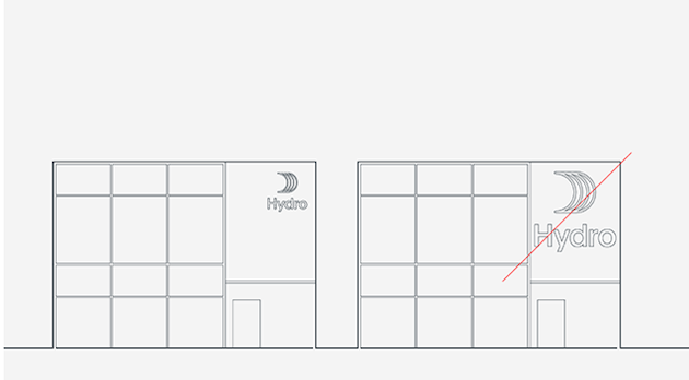
Our most prominent signage is on our facades, and these demand close attention to size and placement. The size ofthe signs is limited by the available space; however, you do not need to exaggerate sizes when space is ample. Signs should be scaled to be clearly visible from the appropriate viewing distance, while also being in balance with the architectural context.

Placement is dictated by the direction(s) from which the buildings are approached by visitors, meaning signs should be placed where they have unobstructed lines of sight from roads and pedestrian routes. Multiple signs can be used to ensure visibility from multiple angles. However, you must avoid using more than one sign on the same facade, or on both sides of the same corner.
Materials and Lighting
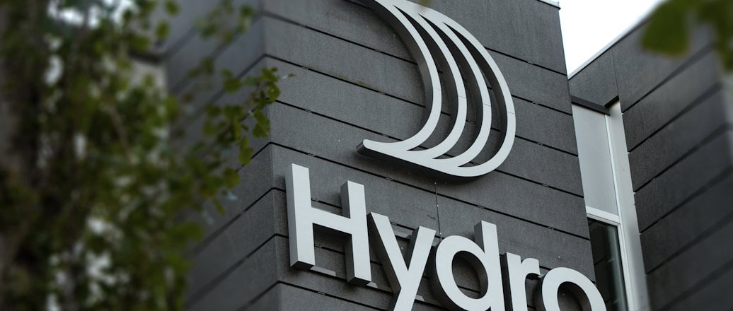
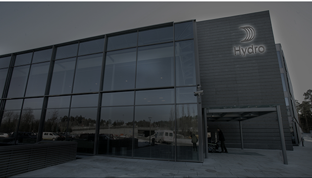
All facade signage must be fabricated in brushed aluminium with clear back trays and internal LED lighting (or similar solution), creating a halo effect.
Panels
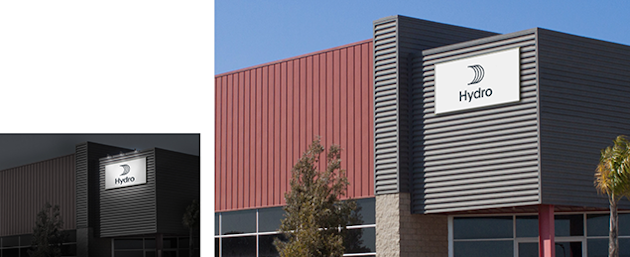
At some locations, panels can be used instead of producing aluminium signage. These panels must use the primary Hydro logo in blue on a white background. Lighting is required.

Updated: May 15, 2024

